Before we start to create the main calendar window we have to define the graphical elements for it. These include the fonts and background graphics. The graphical elements are defined with <element> tag. First we'll create just a font which is used to draw the days on the calendar.
<elements>
  <font id="font.normal" facename="Arial" size="12" />
</elements>
It id attribute is the identification string which is used when the element is referred. It can be any string as long as you don't use the same string twice.
Then we'll create the window for the calendar. A window is just a container for items. It doesn't know or care about the things it contains so there are no calendar windows, event list windows and such; there are just windows which contain items. The window is not limited to contain just a single item. In this example it actually will have multiple items (calendar, year, month and couple of images) and it could also contain the event list and todo list as well.
A window is defined with <window> tags.
<window id="Calendar" w="200" h="200" threshold="48" default="1">
</window>
The id is again the identifier of the window. It also defines the name of the window which is shown in the skin options. The w and h are the width and height of the window. It's not always necessary to define those as Rainlendar can also automatically calculate the dimensions. However this does not work unless the contents has a specific size and position, so unless you're making a window which can have different size (e.g. by using a event or todo list) it's useful to define the exact dimensions for the window.
The threshold is used with the region transparency and it defines the level (0-255) for the transparent pixels. To define a good value for this switch to the region transparency from the advanced options and see which value gets the best results.
If the default attribute is set to 1 the window is shown by default when the skin is selected in the simple mode. You should set it for all the common windows (calendar, event list, todo list).
Inside the window we'll create the calendar.
<calendar id="Calendar.calendar" x="0" y="0" w="200" h="200" layout="GRID">The calendar is defined to fill the whole window for now. The layout defines how the days are laid out on the calendar. The GRID is a standard 7x6 table.
<days>
<appearance layer="0" priority="0" element="font.normal" color="102, 35, 36" align="CENTER" />
</days>
<today>
<appearance layer="0" priority="100" element="font.normal" color="249, 237, 204" align="CENTER" />
</today>
<events>
<appearance layer="0" priority="1" element="font.normal" color="102, 35, 36" align="CENTER" />
</events>
</calendar>
You might have noticed that I used the same color for the events and normal days which isn't very clever since it's not possible to see which days have events. We'll fix that by defining a new font and using it in the events and today.
<elements>
  <font id="font.normal" facename="Arial" size="12" />
  <font id="font.bold" facename="Arial" weight="BOLD" size="12" />
</elements>
<calendar id="Calendar.calendar" x="0" y="0" w="200" h="200" layout="GRID">
  <days>
    <appearance layer="0" priority="0" element="font.normal" color="102, 35, 36" align="CENTER" />
  </days>
  <today>
    <appearance layer="0" priority="100" element="font.bold" color="249, 237, 204" align="CENTER" />
  </today>
  <events>
    <appearance layer="0" priority="1" element="font.bold" color="102, 35, 36" align="CENTER" />
  </events>
</calendar>
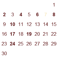
We can now start Rainlendar and take a look at our (unfinished) skin. Just go to Options->Skins and you should see the MyFirstSkin in the list. If you are in the Advanced mode you should switch to the Simple mode. Select the skin from the list and you should see the details that you added to the <info> element for the skin. Click OK and you should see a window that looks something like this:

Quite plain looking and the desktop wallpaper shows through so it's pretty hard to move the window or open the context menu.
Next we'll do something to the background so that the text is more visible. To do this we need to create the background element first and then use it in the window. For background we'll be using two gradients which go to opposite directions.
The elements:
<elements>
  <font id="font.normal" facename="Arial" size="12" />
  <font id="font.bold" facename="Arial" weight="BOLD" size="12" />
  <gradient id="gradient.background1" color1="201, 131, 59" color2="237, 170, 100" direction="VERTICAL" />
  <gradient id="gradient.background2" color1="237, 170, 100" color2="201, 131, 59" direction="VERTICAL" />
</elements>
...and the window:
<window id="Calendar" w="200" h="200" threshold="48" default="1">
  <image id="Calendar.background1" element="gradient.background1" x="0" y="0" w="200" h="200" />
  <image id="Calendar.background2" element="gradient.background2" x="3" y="3" w="194" h="194" />
  <month id="Calendar.month" element="font.large" x="0" y="0" ALIGN="TOP-LEFT" />
  <year id="Calendar.year" element="font.large" x="200" y="0" ALIGN="TOP-RIGHT" />
  <calendar id="Calendar.calendar" x="0" y="0" w="200" h="200" layout="GRID">
    <days>
      <appearance layer="0" priority="0" element="font.normal" color="102, 35, 36" align="CENTER" />
    </days>
    <today>
      <appearance layer="0" priority="100" element="font.bold" color="249, 237, 204" align="CENTER" />
    </today>
    <events>
      <appearance layer="0" priority="1" element="font.bold" color="102, 35, 36" align="CENTER" />
    </events>
  </calendar>
</window>
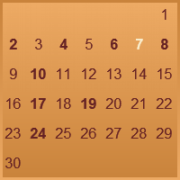
You should note that the background images must be the first entry for the window. The items are drawn in the same order as they are defined so if you overlap the the items the one you want to have behind the other must be defined first.
Our calendar window looks now like this:
Now we'll have to make some room for the month and the year. We'll also use a slightly larger font so let's add the definition to the elements section.
<elements>
  <font id="font.normal" facename="Arial" size="12" />
  <font id="font.bold" facename="Arial" weight="BOLD" size="12" />
  <gradient id="gradient.background1" color1="201, 131, 59" color2="237, 170, 100" direction="VERTICAL" />
  <gradient id="gradient.background2" color1="237, 170, 100" color2="201, 131, 59" direction="VERTICAL" />
  <font id="font.large" facename="Arial" weight="BOLD" size="14" />
</elements>
The month and year go to the top part of the window so we need to move the calendar to start slightly lower. We'll also move the edges of the calendar slightly inwards so it fits better for the background.
<window id="Calendar" w="200" h="200" threshold="48" default="1">
  <image id="Calendar.background1" element="gradient.background1" x="0" y="0" w="200" h="200" />
  <image id="Calendar.background2" element="gradient.background2" x="3" y="33" w="194" h="164" />
  <month id="Calendar.month" element="font.large" x="5" y="5" align="TOP-LEFT" />
  <year id="Calendar.year" element="font.large" x="195" y="5" align="TOP-RIGHT" />
  <calendar id="Calendar.calendar" x="5" y="35" w="190" h="160" layout="GRID">
    <days>
      <appearance layer="0" priority="0" element="font.normal" color="102, 35, 36" align="CENTER" />
    </days>
    <today>
      <appearance layer="0" priority="100" element="font.bold" color="249, 237, 204" align="CENTER" />
    </today>
    <events>
      <appearance layer="0" priority="1" element="font.bold" color="102, 35, 36" align="CENTER" />
    </events>
  </calendar>
</window>
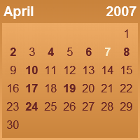
So, now we have month and year in our calendar. The month is in the left side of the calendar in the 5,5 coordinates and the year is on the right side in 195,5. The alignment of the year must be set to TOP-RIGHT so that the text flows to the right. Otherwise it would go outside the window.
The last thing we need to do to the calendar window is to add the weekdays over the day numbers. Rainlendar will position them automatically so we don't have to worry about that. What we need to do is to create a new font for the weekdays and adjust the position of the background the the calendar slightly (and define the weekdays of course).
<elements>
  <font id="font.normal" facename="Arial" size="12" />
  <font id="font.bold" facename="Arial" weight="BOLD" size="12" />
  <font id="font.large" facename="Arial" weight="BOLD" size="14" />
  <font id="font.small" facename="Arial" size="6" />
  <gradient id="gradient.background1" color1="201, 131, 59" color2="237, 170, 100" direction="VERTICAL" />
  <gradient id="gradient.background2" color1="237, 170, 100" color2="201, 131, 59" direction="VERTICAL" />
</elements>
<window id="Calendar" w="200" h="200" threshold="48" default="1">
  <image id="Calendar.background1" element="gradient.background1" x="0" y="0" w="200" h="200" />
  <image id="Calendar.background2" element="gradient.background2" x="3" y="43" w="194" h="154" />
  <month id="Calendar.month" element="font.large" x="5" y="5" align="TOP-LEFT" />
  <year id="Calendar.year" element="font.large" x="195" y="5" align="TOP-RIGHT" />
  <calendar id="Calendar.calendar" x="5" y="25" w="190" h="170" layout="GRID">
    <weekdays abbreviate="1">
      <appearance element="font.small" color="249, 237, 204" align="CENTER" />
    </weekdays>
    <days>
      <appearance layer="0" priority="0" element="font.normal" color="102, 35, 36" align="CENTER" />
    </days>
    <today>
      <appearance layer="0" priority="100" element="font.bold" color="249, 237, 204" align="CENTER" />
    </today>
    <events>
      <appearance layer="0" priority="1" element="font.bold" color="102, 35, 36" align="CENTER" />
    </events>
  </calendar>
</window>
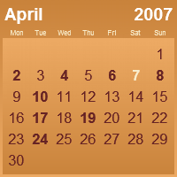
The abbreviate attribute is used to shorten the weekday names since the full names wouldn't fit in the reserved space.
Well, that's it for the calendar window. Next we'll create the event and todo lists and the other windows.
The skin.xml should be like this now:
<?xml version="1.0" encoding="UTF-8"?>
<skin version="1.0">
  <info>
    <version>1.0</version>
    <author>Rainy</author>
    <email>rainy@iki.fi</email>
    <homepage>http://www.rainlendar.net</homepage>
    <comment>The result of the skinning tutorial.</comment>
  </info>
  <elements>
    <font id="font.normal" facename="Arial" size="12" />
    <font id="font.bold" facename="Arial" weight="BOLD" size="12" />
    <font id="font.large" facename="Arial" weight="BOLD" size="14" />
    <font id="font.small" facename="Arial" size="6" />
    <gradient id="gradient.background1" color1="201, 131, 59" color2="237, 170, 100" direction="VERTICAL" />
    <gradient id="gradient.background2" color1="237, 170, 100" color2="201, 131, 59" direction="VERTICAL" />
  </elements>
  <window id="Calendar" w="200" h="200" threshold="48" default="1">
    <image id="Calendar.background1" element="gradient.background1" x="0" y="0" w="200" h="200" />
    <image id="Calendar.background2" element="gradient.background2" x="3" y="43" w="194" h="154" />
    <month id="Calendar.month" element="font.large" x="5" y="5" align="TOP-LEFT" />
    <year id="Calendar.year" element="font.large" x="195" y="5" align="TOP-RIGHT" />
    <calendar id="Calendar.calendar" x="5" y="25" w="190" h="170" layout="GRID">
      <weekdays abbreviate="1">
        <appearance element="font.small" color="249, 237, 204" align="CENTER" />
      </weekdays>
      <days>
        <appearance layer="0" priority="0" element="font.normal" color="102, 35, 36" align="CENTER" />
      </days>
      <today>
        <appearance layer="0" priority="100" element="font.bold" color="249, 237, 204" align="CENTER" />
      </today>
      <events>
        <appearance layer="0" priority="1" element="font.bold" color="102, 35, 36" align="CENTER" />
      </events>
    </calendar>
  </window>
</skin>